ART DIRECTION
GRAPHIC DESIGN
PRODUCT DESIGN
AI IMAGE GENERATION PHOTOGRAPHY
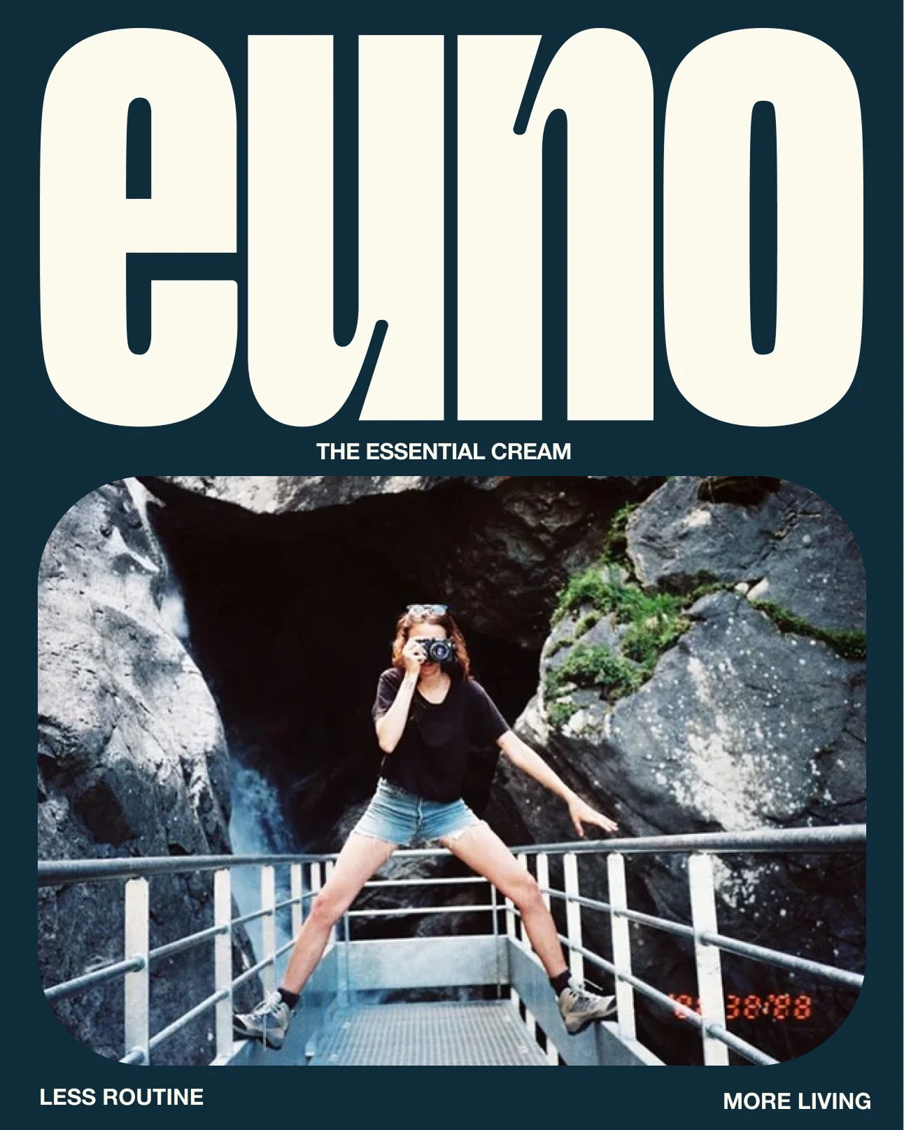
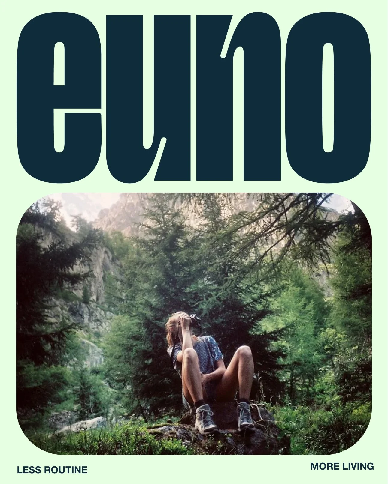
Euno
{Skincare cosmetic brand Spec project}
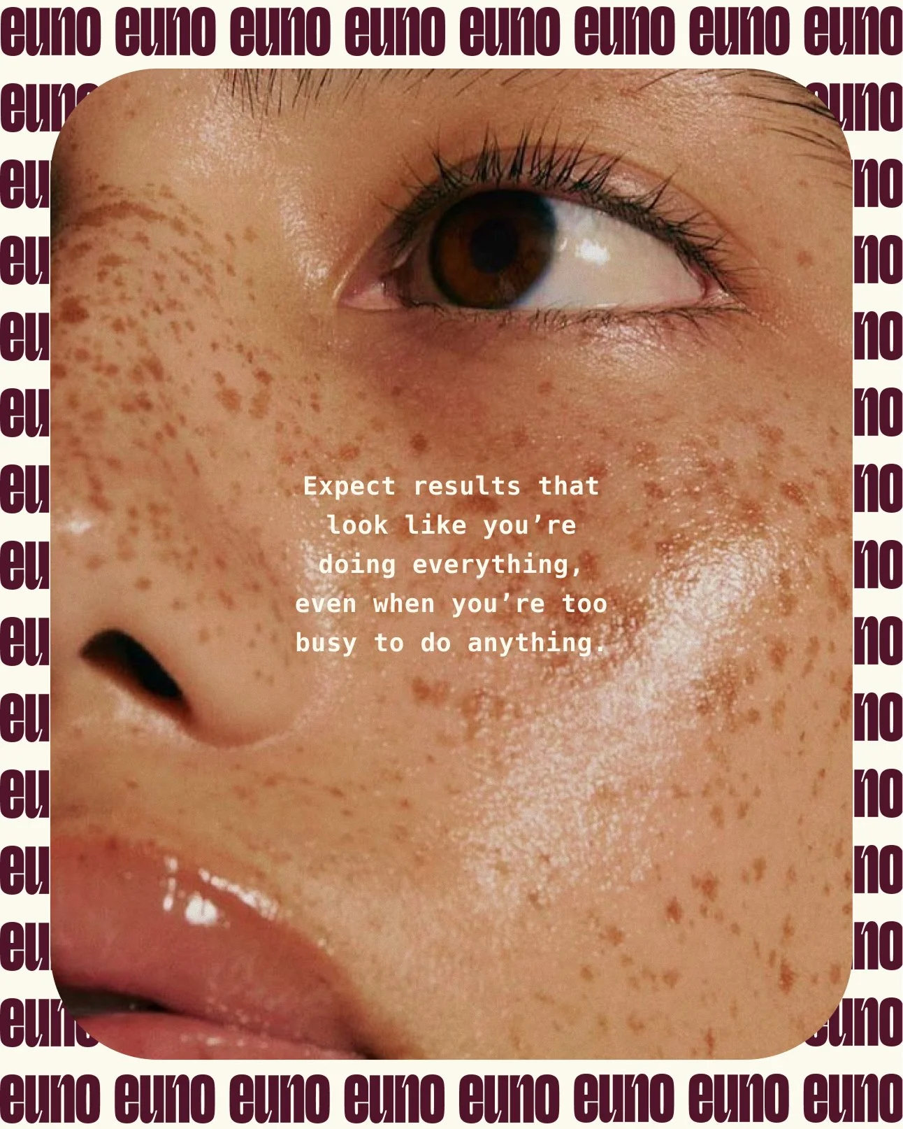
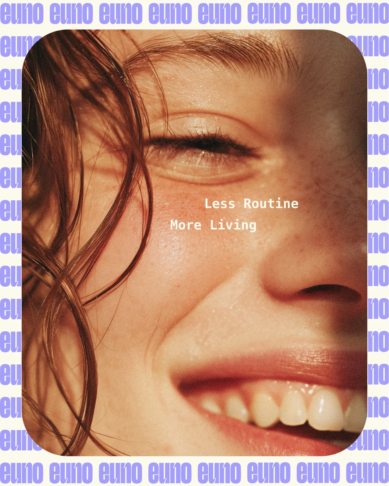
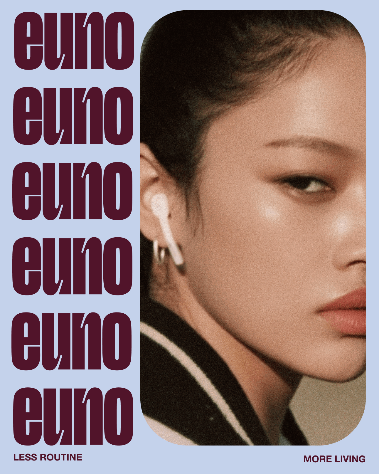
Euno is a minimalist skincare brand created for busy, intentional women who want effective results without complicated routines.
Built around one essential multi-use product, Euno replaces traditional 10-step regimens with a single solution — doing less, but doing it right.
I developed the complete brand identity from concept to execution, including the logo, packaging design, visual identity system, product aesthetics, and full digital presence across social and web.
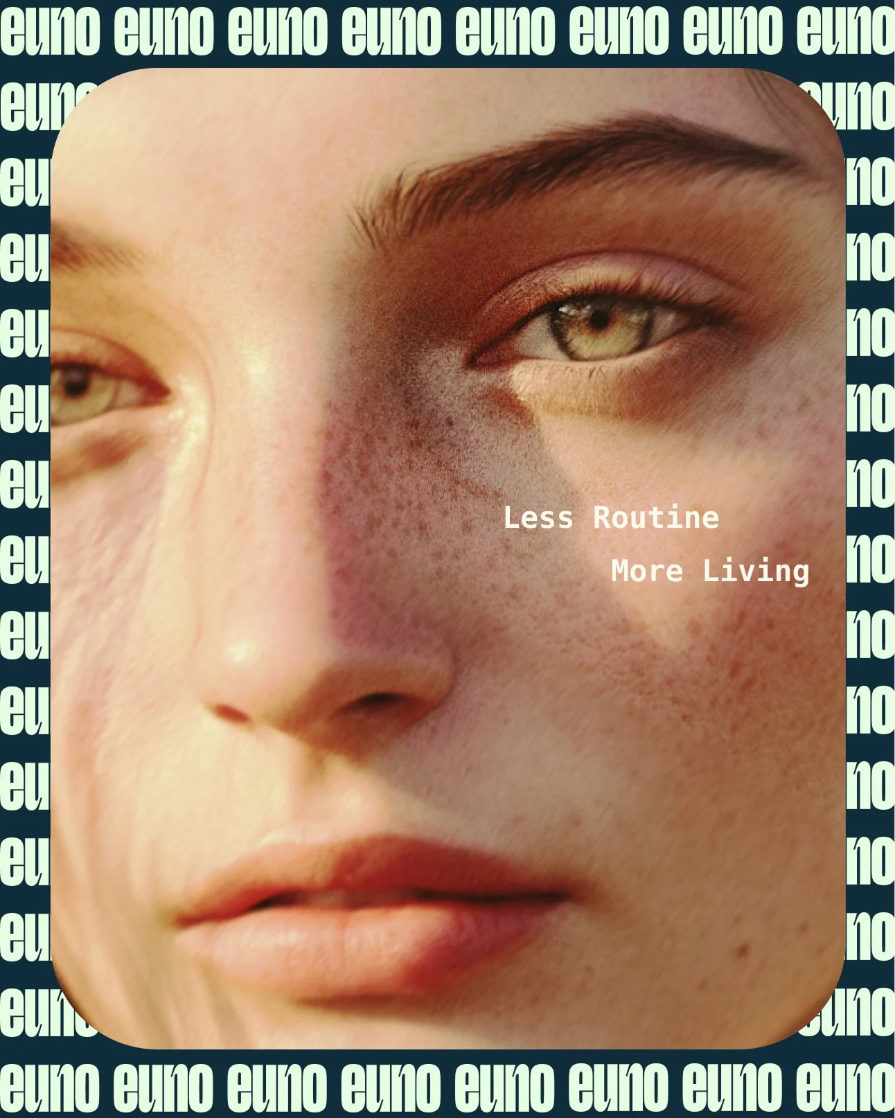
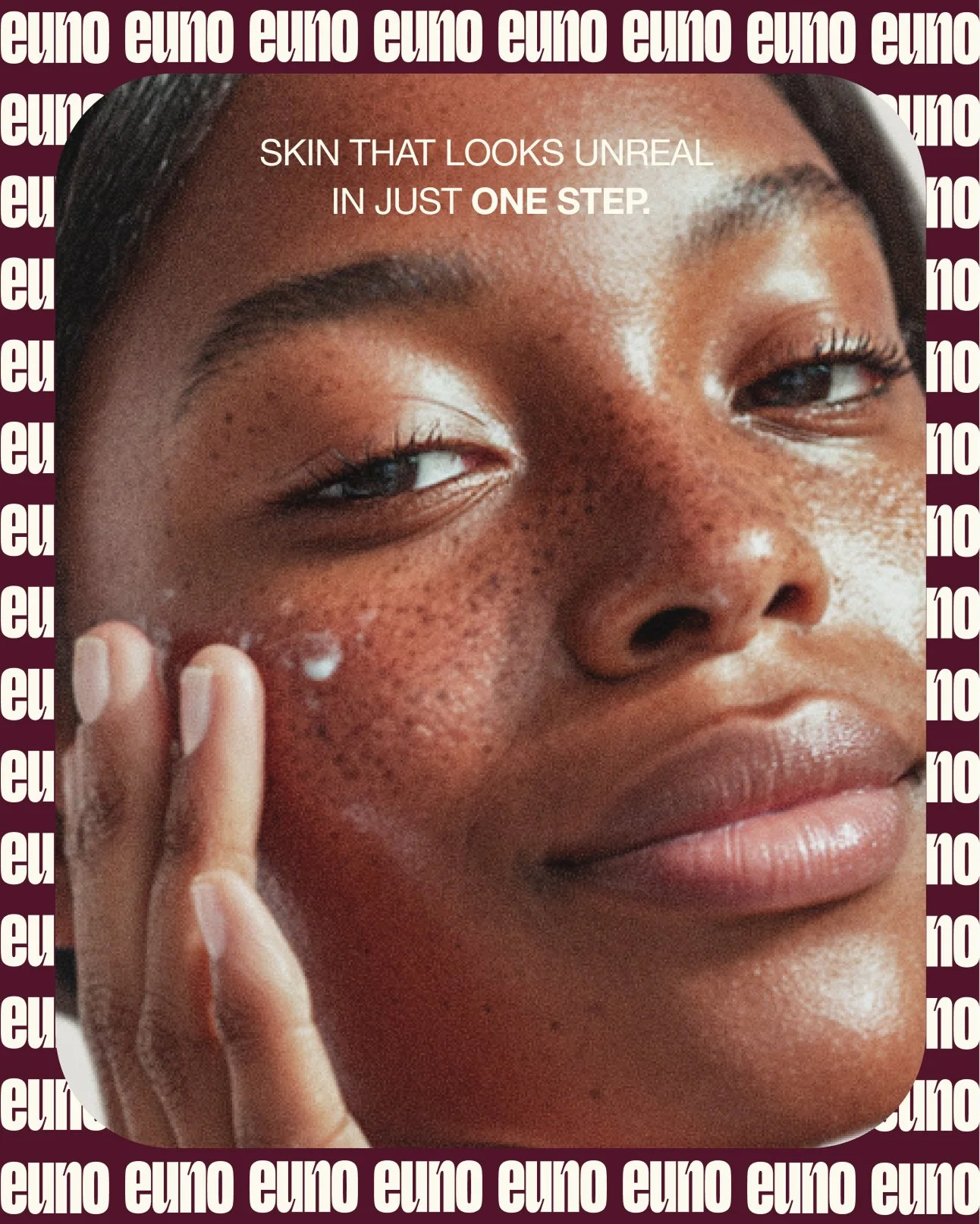
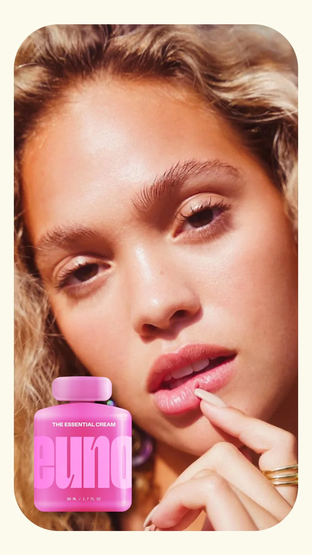
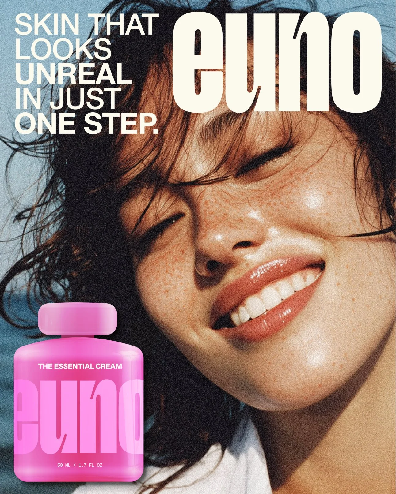


The One-Step Cream


BRAND IDENTITY
Euno’s identity was designed to speak to modern millennial women who want skincare that feels both effortless and elevated. The visual language blends bold confidence with softness, pairing expressive colors with refined minimalism.
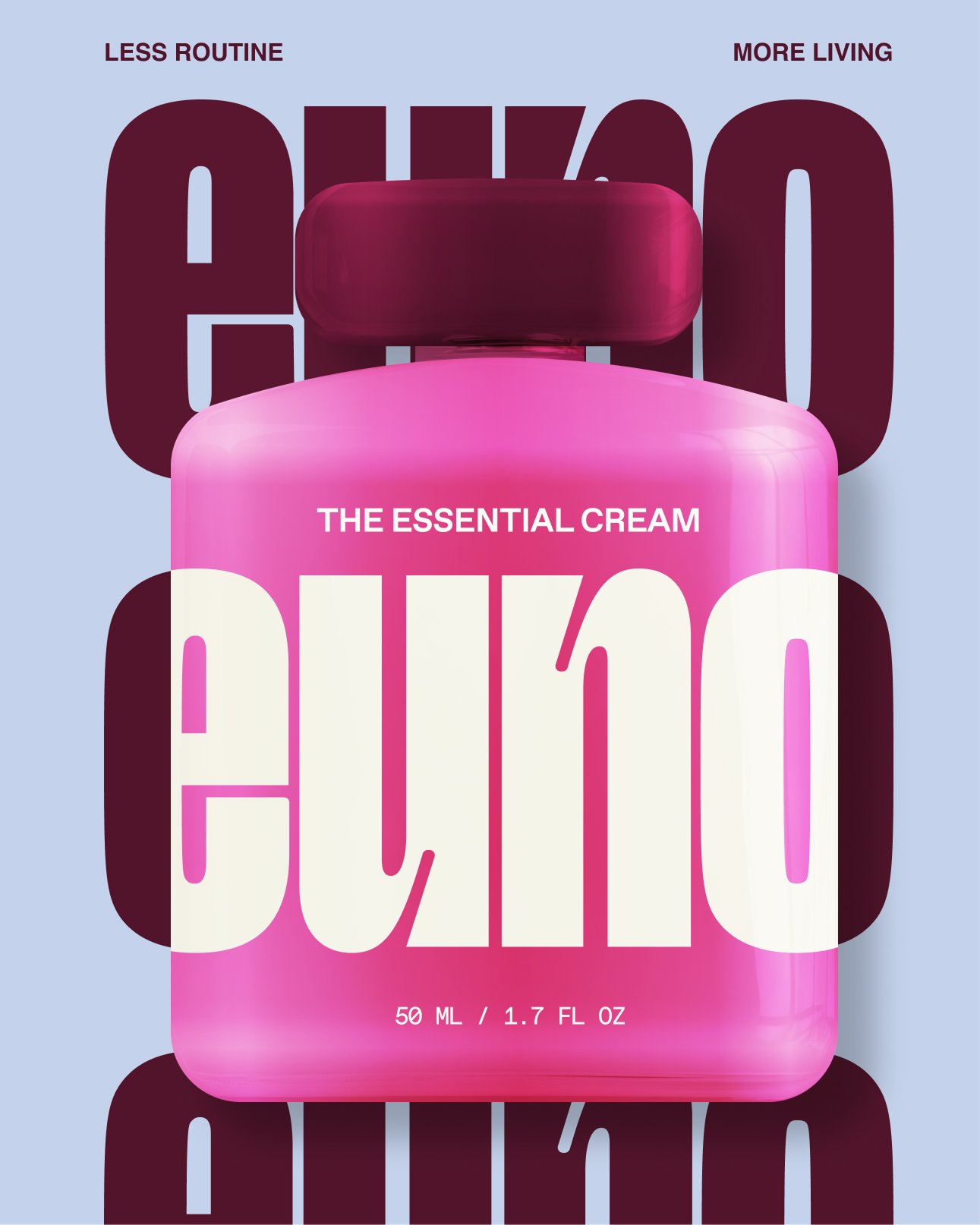
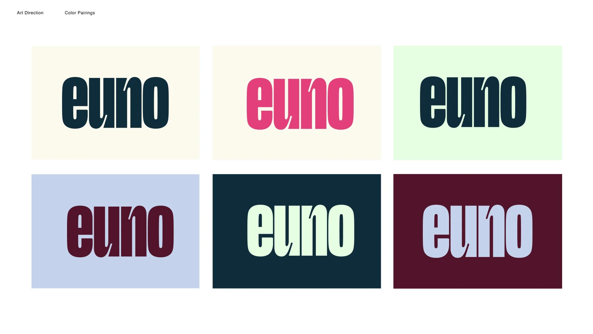
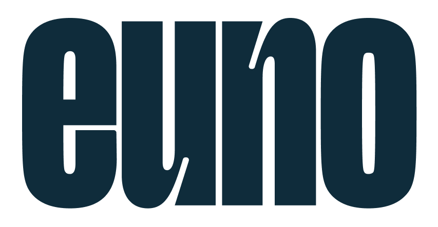
At the heart of the brand is a custom logotype built around playful structural tension: the U and N echo each other in reverse forms, and the subtle ink-trap details give the letters a crafted, contemporary edge. I refined the E by tightening its spacing and softening its lower corner, creating a visual rhythm that mirrors the curves in the U and N for a cohesive, sculpted feel.
Altogether, the identity balances energy and calm in the same way Euno simplifies beauty routines — efficient, distinctive, and quietly luxurious.
DESIGN PACKAGING
The bottle blends luxury, boldness, and feminine softness to match the needs of busy millennial women who want simple but beautiful skincare. Its rounded form echoes the logo’s curves, and the overscale mark makes the brand instantly recognizable.
